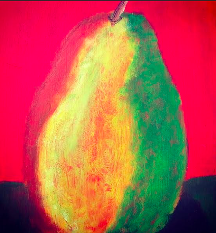
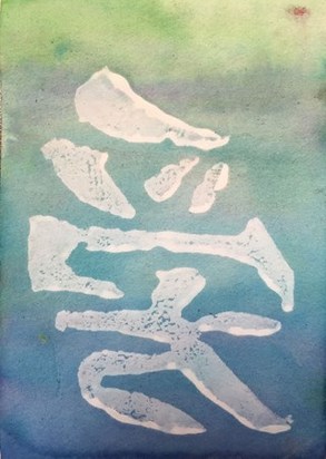
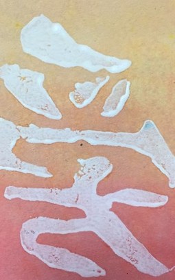
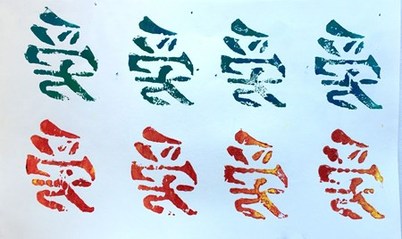
For my postcards, I used my experience with carving stamps and watercolors from the past and brought them both together. After learning the hard way with the rules of watercolors, I thought it would be cool to layer hot and cool colors on each now that I know how to with lighter color. I then used the Japanese symbol stamp to print on top of it once the paint had dried. I felt like this was a good way to show my strengths as more of a hand on type of artist as opposed to a drawing artist. This project has also made me realize that it is time to come out of my comfort zone and try new things rather than stamps and watercolors. It is time for a challenge!
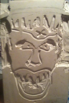
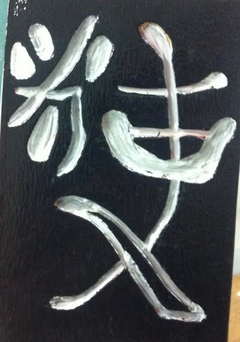
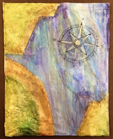
These are more examples of stamps that I have carved. The stamp on the right is the original stamp that I carved for the map below. I decided that it might be cool if I painted it black and white with the ink paint. I did however learn that it takes a week to dry! The carving on the left is not quite finished yet. This is a stamp of a monster that I have to finish the final details of. I am going to try and see how it comes out as a stamp and then I will probably end up painting it with either metallic or acrylic paint. I find carving peaceful and stress-relieving and I really enjoy it because I am not the best when it comes to drawing!
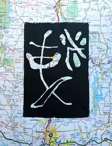
I think that have begun a stamp obssession. I absolutely love carving different symbols and designs that have meaning behind them. At first, I was struggling with the bigger designs, so I resorted to things easier to draw and easier shapes to learn how to carve at first. The stamp on the right is a Japanese symbol for angel and purity. The piece on the right I used a different carving technique. Because the shapes of the symbol were "empty" I was able to try and put a different background behind it that made it unique. This Japanese symbol represents inspiration; I thought it went perfectly with a random map behind it.
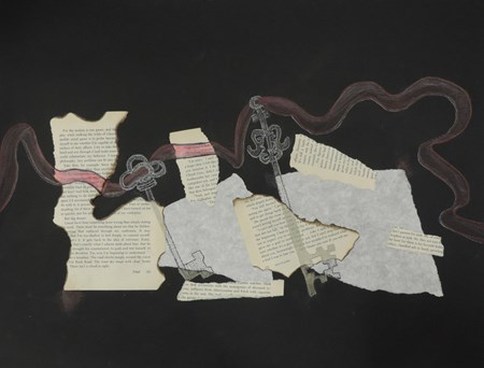 I struggled with this fracture and unity project. For me, it was hard to understand how to layer and connect all of the pieces together. This was challenging but I figured out my problem; by learning how to draw a three dimensional-like ribbon, I was able to figure out the right spots to draw a red ribbon through. I also learned the burning technique for the book pages to get more of an antique, old-fashinoed kind of feel to it by using a lighter to burn the pages. I was however, proud of the old-fashioned keys that I drew and how I laced the ribbon through each key hole too.
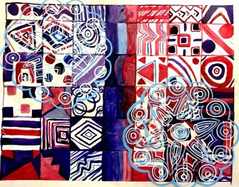 This was by far one of the most creative works of art that I didn't even know I had the potential of creating. I never knew that there was so much behind the usage of watercolors; when to add more water to create a lighter color,when to have less to create a darker color and even learning the importance of using different brushes. My idea at first was to make the left side more "purple-dominant" and the right side more "red-dominant". For the middle of this piece, I chose to use both purple and red to bring the two colors together. I then found an outside source of inspiration which happened to be an aztec flower piece made out of hay material. I drew the image of it twice on a transparency and layer it over opposite corners of this watercolor piece. I didn't like some of my painting in the red side's corner, so layering the flower transparency over it solved my problem. The majority of our class used very light shades of watercolors, so I feel confident in my piece because it is different from my classmates'.
| About MeHi everyone! Archives |
 RSS Feed